Introduction
Customizing your website to match the design and feel of your brand is an essential aspect of website design. Typical website customizations include changing the template, colors, fonts, and layout. Besides the templates we have provided, you can also create and upload a custom layout or designs for your website. Customization can be done through two ways:
- Style Customization
- Template Customization
Zoho Sites
Zoho Sites is an online website builder that helps you build your own website. It is based on drag-and-drop functionality which allows you to enhance and customize your website to suit your requirements.
Website Customization
You can create your own template designs from an existing base layout for your website.
Pre-requisites
- HTML and CSS, and how they work together
- Basics of JavaScript
- Basics of the language FACE
You can check out these links for HTML, CSS, JavaScript and FACE. If you aren't familiar with the mentioned pre-requisites. They'll help you get familiar with creating a FACE template.
- https://www.w3schools.com
- https://developer.mozilla.org/en-US/docs/Web
- https://documentation.zohosites.com/language.html
Style Customization
Style customization can be done by tweaking or overwriting the existing website design using CSS(Cascading Style Sheets). Our site builder has a Custom CSS Editor. Designers and developers can add their own CSS to overwrite the default template styles.
How to add CSS to any element
Add your own CSS files with custom class names to overwrite the existing element styles.
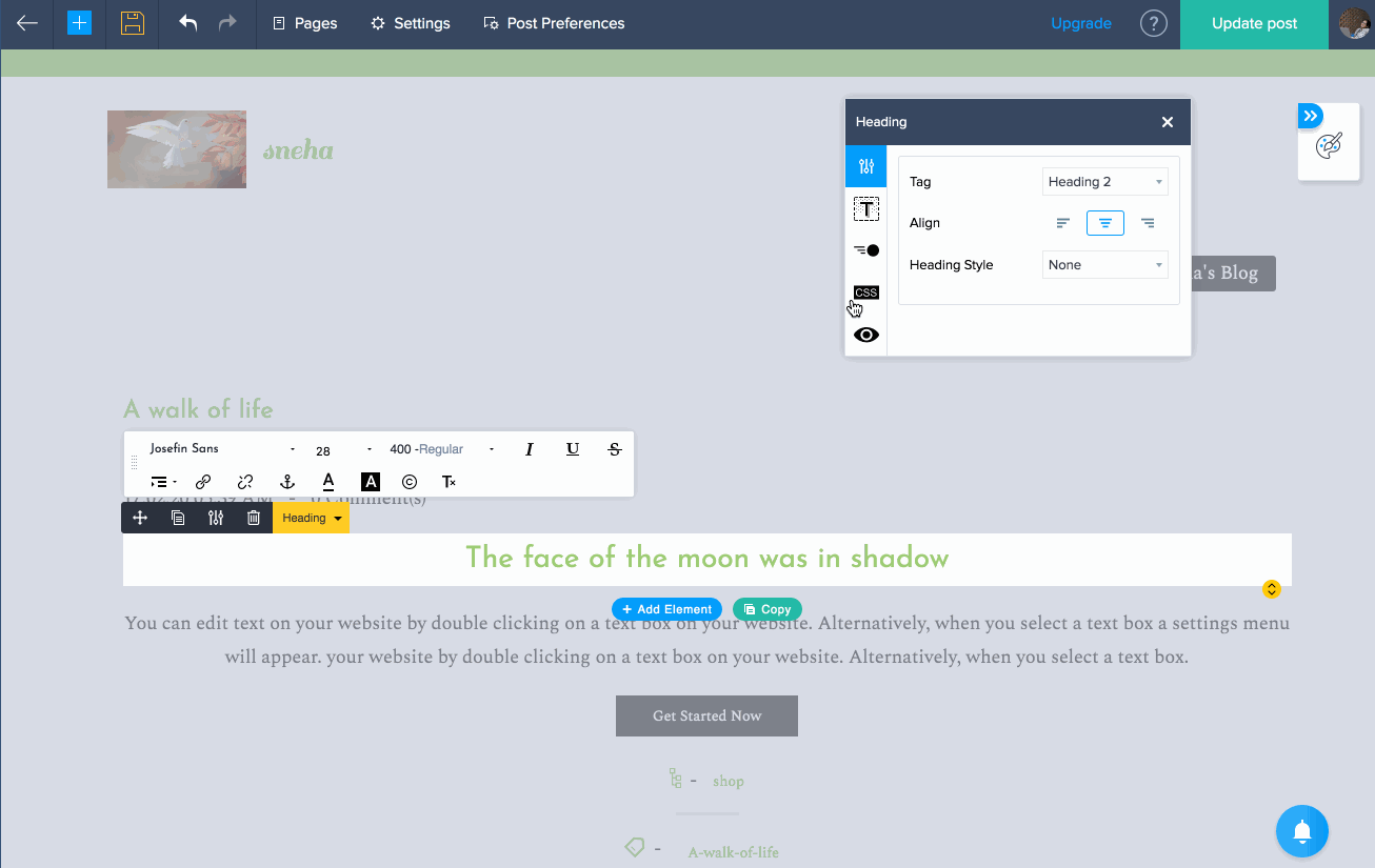
- Select any element on your page, click CSS icon in the element property box.
- Enter custom class names in the text box.
- The class names should not be preceded by the CSS class selector (.).
- You can add multiple class names by separating each name with space.
- Click the Open CSS Editor link to open the custom CSS editor page.
- Add your CSS rule then click Save and close the CSS editor.
Example:
You can add style rules for your own class names as shown below.
.your-own-class-name{
    padding : 10px 20px ;
}
You can add style rules for template elements such as header, banner, and footer. Use developer tools in your browser to find the class names or id's of these template elements.
.theme-header {
    background: #000;
}
You can add style rules for generic DOM elements such as body, div, span, and p as shown below.
body,div,span{
    font-size : 18px ;
    line-height : 1.8 ;
}
p{
    font-size : 16px;
}
Element Property Box - You can customize element properties, class name and animation using the element property box. Select an element that you've added to your page to open its element property box. It's easier to make specific changes to each element. These changes can also be copied around to other locations on the website.
Template Customization
Templates are used to change the layout of your website. Your site preferences and page content are passed to template files via objects.
Each template file works according to its specific data model. Objects help render pages such as blog lists, blog posts, and regular pages. You can create a template, then manage the layout according to your site preferences.
How it works?
The following details shows how our template system works. We have categorised our templates into two types,
- Base template
- Sub templates
Base template
It acts as a parent template, it contains all the necessary templates files and it is not listed in the templates list for site creation.
Sub template
These templates acts as a child template that these templates inherit or utilizes files from base template or parent template.
The templates which you are choosing while site creation are all sub-templates. That if you open any customized template there will be only necessary files or it contains only modified base template files. Other files will be served or rendered directly from the base template.
How to Customize?
You can customize your template by following the below steps,
- Download our base template and extract it, you will find all the template files in it.
- Now go to settings -> templates -> edit html/css
- To modify a existing template file, create a new file with the same name as it is in base template and copy the code from base template and paste it in your customized template.
- Make the changes you want to do in it and save the file.
- Now your code will replace the existing code served from base template.
- Go to the builder and check the changes you have made.
- In case if you need the previously served design or file, just remove the file you have created and customized.
- Now the file will be served from the base template.
Example:
We are going to change the branding style of the template by following the below steps
- Go to settings -> templates -> edit html/css
- Inside face directory create a new face file with name "_branding.face"
- Now copy code from "_branding.face" file from base template and paste it in newly created face file.
- Do some changes and save the file.
- To change css property inside stylesheets directory create a new file "header.scss" and copy paste code from "header.scss" file in base template.
- Now goto builder and check the changes you have made are reflected.
Template Files Overview
FACE files and Configuration files can be considered as building blocks of a template. It is categorized into the following three parts:
- Main View Files
- Partial View Files
- Configuration Files
I. Main View Files
Face files are main view files. Our template system will render these files alone. These files are the entry point to your template. After this, the extended or included partial view files are rendered.
Face files are main view files. Our template system will consider these files alone. These files are the entry point to a template. After this, the extended or included partial view files will be rendered.
page.face
This file acts as the chief layout for every page you create. This layout will contain your banner content and page content. The structure of each page will be decided by this file.
blog-list.face
This file lists every published blog post. It contains your post image, title, category, tags, and a short description of each post.
blog-post.face
This file renders a detailed view of an individual post. It contains images, title, full description, social share, and comment box.
II. Partial View Files
The partial view files contain only a part of the main view file codes. They are kept in a separate file. Partial view files were created to facilitate modular programming for easier code maintenance. You can also follow include partial view file's code in the main view file.
We strongly recommend that you follow the modular programming approach. For example, we've kept the navigation code as a partial file and named it "_navigation.face". This is because it will be reused in multiple main view files like page.face, blog-list.face, and blog-post.face. If we need to make any changes for navigation, we can simply modify one file instead of making changes in three different files.
We use underscores at the beginning of the file name to differentiate partial view files from main view files. The partial files that are used in the template are as follows.
- _navigation.face - Contains the navigation code. It will include all the menu sections.
- _contacts.face - Contains the top-bar contact information such as email id and phone number. This will be made available on each page of the website.
- _social-links.face - Contains the social icons that are used in the top bar.
- _member-portal.face - Contains the sign-up and sign-in links used at top bar. Applicable only if your website requires registration.
- _theme.face - Is extended by every main view file. The HTML markup head and body are in this file. Usually header and footer will be included in this file.
III. Configuration file
The template.conf file is written in JSON format. It gives template meta details to our template system. It's then used to configure your website based on the installed template. The template.conf file contains details about the template, template author, and face file inclusion. It is based on the layout, default banner slide and your default site settings. We need to make changes in this document at appropriate places for the changes to reflect in the website where we are using this private template.
Template Creation
To create a custom template, download the starter template.zip file. Extract the zohosites_starter_template.zip file and open the folder in your preferred file editor.
You should keep FACE files and configuration files in root directory. Custom files like stylesheets, JavaScript files, and images can be loaded from any level of the directory. We've organized the template files in this structure to access and maintain your file easier.
Going forward we'll be referring to page.face, blog-list.face, and blog-post.face as main view files.
Make sure you don't rename the main view files, as template systems will not be able to identify them. If required, you can create or edit any partial file and extend or include them in the main view file.
We keep the header, footer, and other objects that are used throughout the website in _theme.face file to maintain your code. It also helps us manage using the header and footer across the site.
Example:
In the example below, we will be showcasing how to change existing branding layout with your own layout.
-
Copy this file from base template _branding.face and paste it in your custom template directory.
-
Open your custom template directory in your fav text editor.
-
Now change the layout as per your need in _branding.face
-
Add a new CSS file and name it "newbranding.css" in the stylesheets folder. Add your preferred CSS rules to customize the branding layout. You can even create multiple new CSS files in the stylesheets folder, and include it through the template.conf file.
-
Open the template.conf file in the layouts array. Add the path of the newly created css file as a property of stylesheets in page.face.
"stylesheets": [ "stylesheets/newbranding.css", "stylesheets/custom1.css", "stylesheets/custom2.css" ], -
Zip the template folder.
-
Go to your site settings, then choose templates.
-
Click the upload template button in the top-right corner of the page.
-
Choose the zipped template file and click Okay.
Your modified layout will be applied to branding container of your site.
Note: Your screen will display a failure notification if you upload a template with errors or missing files.
Template Configuration
This file is written in JSON format. It provides template meta details to our template system. It is then used to configure your website based on installed template. It contains details about the template, template author, file inclusion based on layout, default banner slide, and the default site settings.
We've split it into two parts:
- Personal JSON key-value pairs
- Website JSON key-value pairs
Personal JSON Key-Value Pairs
These keys help us identify unique templates and its author details. design_id - Assign a unique ID to every new template. If a different ID is mentioned, it will be saved as a new template. Your existing template will get overwritten if you use the same design_id for another template. This key is mandatory.
Template1 --> "design_id":"template_id_1"
Template2 --> "design_id":"template_id_2"
.
.
.
TemplateN --> "design_id":"template_id_N"
name - Assigns a name that will appear when your template is displayed.
Template1 --> "name": "template_1"
Template2 --> "name":"template_2"
.
.
TemplateN --> "name":"template_N"
version - Defines a version. The value can be alpha-numeric.
"version": 1
"version": 1.1
"version": beta1.2
author - Assigns the author's name. This key is mandatory.
"author": "author_name"
author_email - Defines the author's email address. This key is mandatory.
"author_email": "author_email@author.com"
Website JSON Key-Value Pairs
These keys help us tell our template system which files need to be included. They also tell the default site settings based on the installed template.
preview_images - Displays an image of your template in the preview. This key is mandatory.
"preview_images": [ "images/preview.png" ]
template_default - Assigns values to either show or hide elements like site name, site logo, and site caption.
"template_default": {
            "show_site_name": false,
            "show_site_logo": false,
            "show_site_caption": false,
            "blog_social_share_options": {
                    "align": "right",
                    "style":"05",
                    "show_count": true
        }
}
fonts - Assigns the default fonts to be loaded on your website. In the example below, Nato will be applied to body, and Nunito will be applied to heading elements. In the upcoming section we will explain how to get font names from our library and how to include third party web fonts.
"fonts" : "Nato+Sans:400,700/Nunito"
stylesheets - Includes these CSS and SCSS files to every page, including blog pages.
"stylesheets": [ "stylesheets/style1.css","stylesheets/style2.scss" ]
javascripts - Includes these JavaScript files in every page, including blog pages.
"javascripts": [ "js/script1.js","js/script2.js" ]
layouts - This key is used to include specific CSS and JavaScript files to every page, including blog pages.
"layouts": [
            {
                "name": "page.face",
                "stylesheets": [
                        "stylesheets/style.css"
                ],
                "javascripts": [
                        "js/script.js"
                ]
            },
            {
                "name": "blog-list.face",
                "stylesheets": [
                        "stylesheets/blog-style.css"
                ],
                "javascripts": [
                        "js/blog-script.js"
                ]
            }
      ]
Template & Font Library
Steps to upload your template
-
Download the Base template and Sub templates.
-
Extract the .zip and modify your template as required.
-
Zip the folder.
-
Go to your site builder, then click Settings -> Templates.
-
Click Upload Template in the top-right corner of the page.
-
Upload the .zip, then install the uploaded template.
Steps to include fonts from our library
-
Go to your site builder and open a site you've created.
-
Click Settings, then navigate to Visual Editor -> Presets -> Custom Values -> Typography.
-
Click Base Font and select the Add Font option. This will open our font library.
-
You can search for the font you prefer in our font library. Include that font's name on the fonts key-value pair in template.conf file.
-
Include fonts in the format below:
- If your fonts name has a space, that space must be replaced with the + sign.
Example: If your font name is "Nato Sans".
Syntax: "fonts" : "Nato+Sans"
- The font weight by default will be regular 400, for semibold, bold, and extrabold, the weights will be 600, 700, and 900 respectively.
Example: If bold and regular fonts are required, it can be mentioned as such:
Syntax: "fonts" : "Nato+Sans:400,700"
- You can include multiple fonts by separating each font by "/"
Example: To include Nato Sans and Nunito fonts:
Syntax: "fonts" : "Nato+Sans:400,700/Nunito"
Note: To include fonts from other resources, add the @import rule at the top of your template stylesheet.
Navigation
Designers and developers can create their own template from scratch. In this article you'll learn how to create or modify your site navigation.
Prerequisites
- You should be familiar with HTML, CSS, and how they work together.
- You should be familiar with the basics of the FACE template language.
You can check out these links for HTML, CSS and FACE. If you aren't familiar with the mentioned prerequisites. They'll help you get familiar with creating a FACE template.
Navigation Structure
For easier code maintenance we've kept the navigation code in _navigation.face.
The _navigation.face is included at the top of the _theme.face. The navi (menu) macro returns the entire menu structure from _navigation.face.
macro is similar to function in other programming languages, which helps you reuse that chunk of code.
Below, you can find DOM structure in _theme.face. You can customize the menu container and menu items list in _navigation.face and _theme.face as required.
<div class="theme-menu-area">
        <div class="theme-menu">
                {{navi(menu)}}
        </div>
</div>
Example:
Let's consider a situation where your site has four menu items named, "Home, About, Services, and Contact". The rendered navigation structure will be as follows.
<div class="theme-menu-area">
      <div class="theme-menu">
                <ul>
                          <li>
                                    <a href="/home" target="_self"> Home </a>
                          </li>
                          <li>
                                    <a href="/about" target="_self"> About </a>
                          </li>
                          <li>
                                    <a href="/services" target="_self"> Services </a>
                          </li>
                          <li>
                                    <a href="/contact" target="_self"> Contact </a>
                          </li>
                </ul>
      </div>
</div>
Building Block of Navigation
The FACE file below is the building block of navigation. Here's how it works:
_navigation.face
Your website's navigation HTML markup and dynamic data is bound in this file. Every menu item that you've added in the site builder is served to this page via the menu face object. You can access the menu items from the face object, "menu.menu_items". Each menu item contains details like menu item name, unique ID, URL, and target. We will explain what these details do a little later in this article.
Macro in face language can be compared to functions in regular programming language. They allow you to define reusable chunks of content.
We use macro and loop statements to iterate menu objects and print the multi-level menu items. You can insert your own logic to print the menu items based on your preference. Though, we suggest that you use the same logic we have provided, to ensure code consistency and maintenance.
Let's take a look at what every statement does in _navigation.face
{% macro navi(menu) %}
        {% assign sub_menus=menu.menu_items %}
        {% if sub_menus %}
                <ul>
                        {% for sub_menu in sub_menus %}
                                {% assign count = 1 %}
                                {{ subnavi(sub_menu, count) }}
                        {% endfor %}
                </ul>
        {% endif %}
{% endmacro %}
- macro navi(Menu) In the statement above, we have passed the menu object as an argument to navi macro. The macro returns the entire menu structure when called from any face file.
- assign sub_menus = menu.menu_items
We have assigned menuitems to the submenus variable. It contains a list of first level menus. It can also contain menus up to four levels.
- for sub_menu in sub_menus We've iterate the menu_items object to access each menu_item.
- assign count = 1 We've assigned the count to one to filter the first level menu item.
- subnavi(sub_menu, count) The macro named subnavi is called inside the macro navi. During which, it returns the menu items list.
- subnavi definition In the example below, the macro definition subnavi is provided with the arguments menu_item as sub_menu and menu hierarchy level as count.
{% macro subnavi(menu_item, count) %}
      <li {% if menu_item.more_menu
       %}data-zp-more-menu="menuplaceholder"{% endif %}>
                {% assign sub_menus=menu_item.menu_items %}
                <a href="{% if menu_item.url %}{{menu_item.url}}{% else
                %}javascript:;{% endif %}" {% if menu_item.target
                %}target="_blank" {% else %}target="_self" {% endif %}>
                        {{menu_item.item_name}}
                        {% if sub_menus && sub_menus | length > 0 %}
                               {% if count == 1 %}
                                     <span class="theme-sub-li-menu
                                      theme-non-responsive-menu
                                      theme-submenu-down-arrow">
                                     </span>
                               {% else %}
                                     <span class="theme-sub-li-menu
                                      theme-non-responsive-menu
                                      theme-submenu-right-arrow">
                                     </span>
                               {% endif %}
                               <span class="theme-sub-li-menu
                                theme-responsive-menu theme-submenu-down-arrow">
                               </span>
                        {% endif %}
                </a>
                {% if sub_menus && sub_menus | length > 0 %}
                        <ul class="theme-sub-menu" style="display:none;">
                                {% for sub_menu in sub_menus %}
                                        {% assign temp_count = count+1 %}
                                        {{ subnavi(sub_menu, temp_count) }}
                                {% endfor %}
                        </ul>
                {% endif %}
      </li>
{% endmacro %}
- assign sub_menus = menu_item.menu_items In the statement above, the variable sub_menus is assigned with the second level menu items of first level menu item.
<a href="{% if menu_item.url %}
                {{**menu_item.url**}}
        {% else %}
                javascript:;
        {% endif %}"
        {% if **menu_item.target** %}
                target="_blank"
        {% else %}
                target="_self"
        {% endif %}
>
The html markup and anchor tag is passed with current menu_item details like url and target.
- {{ menu_item.item_name }} The menu item name is printed as an anchor text.
- sub_menus && sub_menus | length > 0 Based on the conditional statement, we've included a dropdown arrow icon to check whether the second level menu exists.
- count == 1 We check whether the current menu_item is level one or nested. The right arrow or down arrow will be included based on this condition. The count is when the current menu_item is a level one menu item.
<ul class="theme-sub-menu" style="display:none;">
This markup is included only if a menu item has submenu items. It's displayed as a hovering parent menu item in desktop and on click in mobile responsive.
- for sub_menu in sub_menus The submenu items get iterated if the current menu has submenus.
- assign temp_count = count+1 The temp_count variable is assigned a greater value than the count variable to mention that it is not a level one menu item.
- subnavi(sub_menu, temp_count) The subnavi macro is nested and called to include the submenu items of current menu.
You can write your own CSS and JavaScript to toggle a dropdown menu, or even a hamburger menu on smaller devices.
Note: We have a menu library that contains functions to toggle dropdown menus, hamburger menus, dropdown animation, and orientation detection.
Navigation using our menu library
You don't need to write JavaScript. You can handle the submenu drop-down, hamburger menu, and dropdown animation with the data-attributes for functions in our menu library. All you need to do is place the data-attributes we provide on the respective elements in the html markup.
Non-responsive devices - Devices with a width greater than 768px, such as desktops and laptops. Responsive devices - Devices with a width lesser than or equal to 768px, like mobile devices and tablets.
Non-responsive menu container
The HTML markup below acts as a menu container in larger devices by default. The navi (menu) macro returns the entire menu structure.
<div class="theme-menu-area" data-zp-nonresponsive-container="menuplaceholder">
        <div class="theme-menu"
               data-non-res-menu='zptheme-menu-non-res'
               data-zp-theme-menu="
               id: menuplaceholder;
               active: theme-menu-selected;
               orientation: horizontal;
               maxitem: 5;
               position: theme-sub-menu-position-change;
               submenu: theme-sub-menu;
               moretext: more;
               nonresponsive-icon-el: theme-non-responsive-menu;
               responsive-icon-el: theme-responsive-menu;
               burger-close-icon: theme-close-icon;
               animate-open: theme-toggle-animate;
               animate-close: theme-toggle-animate-end;
               open-icon: theme-submenu-down-arrow;
               close-icon: theme-submenu-up-arrow;
               root-icon: theme-submenu-down-arrow;
               subtree-icon: theme-submenu-right-arrow;
               ">
                    {{navi(menu)}}
        </div>
</div>
- data-zp-nonresponsive-container = "menuplaceholder" This data-attribute represents the element that is a menu container for larger devices. This data attribute value should be a unique ID of the menu. It represents that the element is a target menu with this ID.
- data-non-res-menu = 'zptheme-menu-non-res' The data represents that this element is the menu that is used in header.js. This removes or adds contact info.
- data-zp-theme-menu = ' ……. ' This data-attribute is used to represent that this element is a menu and its value contains meta data of a menu with a key value pair. Here's what they do:
-- id : menuplaceholder This option helps distinguish a specific menu from multiple menus by assigning a unique menu ID. It can be any string.
-- active : theme-menu-selected This option adds its value as a class name to the active menu item.
-- orientation : horizontal Specify whether your menu is horizontal or vertical in this option. By default, this option is set as horizontal. If the menu items length is more than menu container width, then the overlapping menu items will be nested inside the menu item named "More".
-- maxitem : 5 This option restricts the number of menu items to be displayed if menu orientation is set as vertical. To avoid the vertical menu UI collapsing, we prefer to display a maximum of five menu items. Menu items that exceed the five item limit will be nested inside a menu item named More.
-- position : theme-sub-menu-position-change This option adds its value as a class name to a submenu container when it overlaps the menu container width. We use this class name while writing CSS to bring that submenu container inside a visible area.
-- submenu : theme-sub-menu The class name of a sub-menu container should be used as a value for this option. Then it is used in menu-helper.js to target the sub-menu container.
-- moretext : more This option lets you replace the more menu item text. -- nonresponsive-icon-el : theme-non-responsive-menu The class name for the arrow icon (for larger devices) is used inside the menu item. It is then used to select objects to change the arrow directions in menu-helper.js file.
-- responsive-icon-el : theme-responsive-menu The class name of arrow icon (for smaller devices) is used inside menu item. It is also used to select objects and change arrow directions in menu-helper.js file.
-- burger-close-icon : theme-close-icon In smaller devices, when the burger menu is selected, the value of this option will be added as a class name to burger menu.
-- animate-open : theme-toggle-animate In smaller devices (responsive), when the burger menu is opened, the value of this option will be added as a class name to the responsive menu container.
-- animate-close : theme-toggle-animate-end In smaller devices (responsive), when the burger menu is closed, the value of this option will be removed from the class name of the responsive menu container.
-- open-icon : theme-submenu-down-arrow In smaller devices, when opening the submenu dropdown, the value of this option will be added to the arrow icon to change its direction.
-- close-icon : theme-submenu-up-arrow In smaller devices, when closing the submenu dropdown the value of this option will be added to the arrow icon to change its direction.
-- root-icon : theme-submenu-down-arrow The value of this option must be a class name of arrow used in the root menu (first level menu). It's used to push or pop overlapping menu items into or from more menu item.
-- subtree-icon : theme-submenu-right-arrow The value of this option must be a class name of arrow used in the sub menus (nested level menus). It is used to push or pop overlapping menu items into or from more menu items.
Responsive menu container
The HTML markup below acts as a menu container in smaller devices. Let's see how the data-attributes are used in it.
<div class="theme-responsive-menu-area theme-navigation-and-icons zpcontainer">
        <div class="theme-responsive-menu-container"
        data-zp-burger-clickable-area="menuplaceholder">
                <span class="theme-burger-icon"
                data-zp-theme-burger-icon="menuplaceholder">
                </span>
        </div>
        <div class="theme-responsive-menu theme-menu-area"
        data-zp-responsive-container="menuplaceholder">
        </div>
</div>
- data-zp-burger-clickable-area = "menuplaceholder" In smaller devices, this attribute used to represent the clickable area of the burger menu. The menu ID should be given as a value to this attribute.
- data-zp-theme-burger-icon = "menuplaceholder" In smaller devices, this attribute is used to represent the burger menu icon. The menu ID should be given as a value to this attribute.
- data-zp-responsive-container = "menuplaceholder" In smaller devices, this attribute is used to represent the menu container in which the menu items will be appended. The menu ID should be given as a value to this attribute.